Flowpay
Industry: Fintech
Platform: iOS Mobile App
Role: UX/UI Designer
Project Duration: 4 weeks
Tools Used: Figma, Notion, Maze, Illustrator

🧩 The Problem
In today’s digital-first economy, personal finance apps have become essential—but many of them overwhelm users with clunky interfaces, confusing navigation, and financial jargon. During research, we found that users often:
- Had difficulty finding core actions like transferring money or checking recent transactions.
- Struggled to understand balance and transaction breakdowns at a glance.
- Felt anxiety using apps that lacked a clear, welcoming tone or visual clarity.
Our goal was to design a fintech app UI that felt as intuitive as texting a friend—accessible, friendly, and actionable in just a few taps.
🎯 The Challenge
We set out to design a mobile banking app UI that could:
- Build trust with a clean, minimal interface.
- Make it incredibly simple to manage everyday transactions like sending, requesting, or withdrawing money.
- Surface important data (like balance and recent activity) in a clear, digestible way.
- Reduce user friction and decision fatigue through thoughtful layout and visual hierarchy.
🧪 Research & Insights
We conducted quick usability interviews with 10 users aged 25–45 who actively use apps like Venmo, Cash App, and Chime. Key takeaways:
- Speed is crucial: People want to open the app, see their balance, and take action—fast.
- Clarity reduces anxiety: Confusing layouts made users fear accidental transactions.
- Icons + labels beat text-heavy interfaces: Users preferred clear visual language for actions like “Send” or “Withdraw.”
Based on this, we created 3 core design principles for FlowPay:
✅ Show balance and recent activity instantly
✅ Reduce visual clutter
✅ Make actions easy, tappable, and understandable
🛠 UX Process
1.
Wireframing & Flow Mapping
We first mapped the primary user journey:
Open app → Check balance → Send/request money → View transaction history
Then we sketched out basic wireframes focusing on minimal taps, simplified copy, and large actionable buttons. The initial concepts emphasized a card-based layout to organize information cleanly without overwhelming users.
2.
Low-Fidelity Testing
We created a clickable wireframe and tested it with 5 users. This helped us validate button placement, action flow, and what users noticed first. Based on feedback, we:
- Increased font size on the balance
- Grouped “Send / Request / Withdraw / Deposit” as a fixed button row
- Removed dropdown menus that caused decision hesitation
3.
Visual Design
To establish brand trust, we chose:
- A teal gradient for the balance card (evokes calm, security)
- White background for clarity and modernity
- Rounded sans-serif font for approachability
- Simple, consistent icons for each action
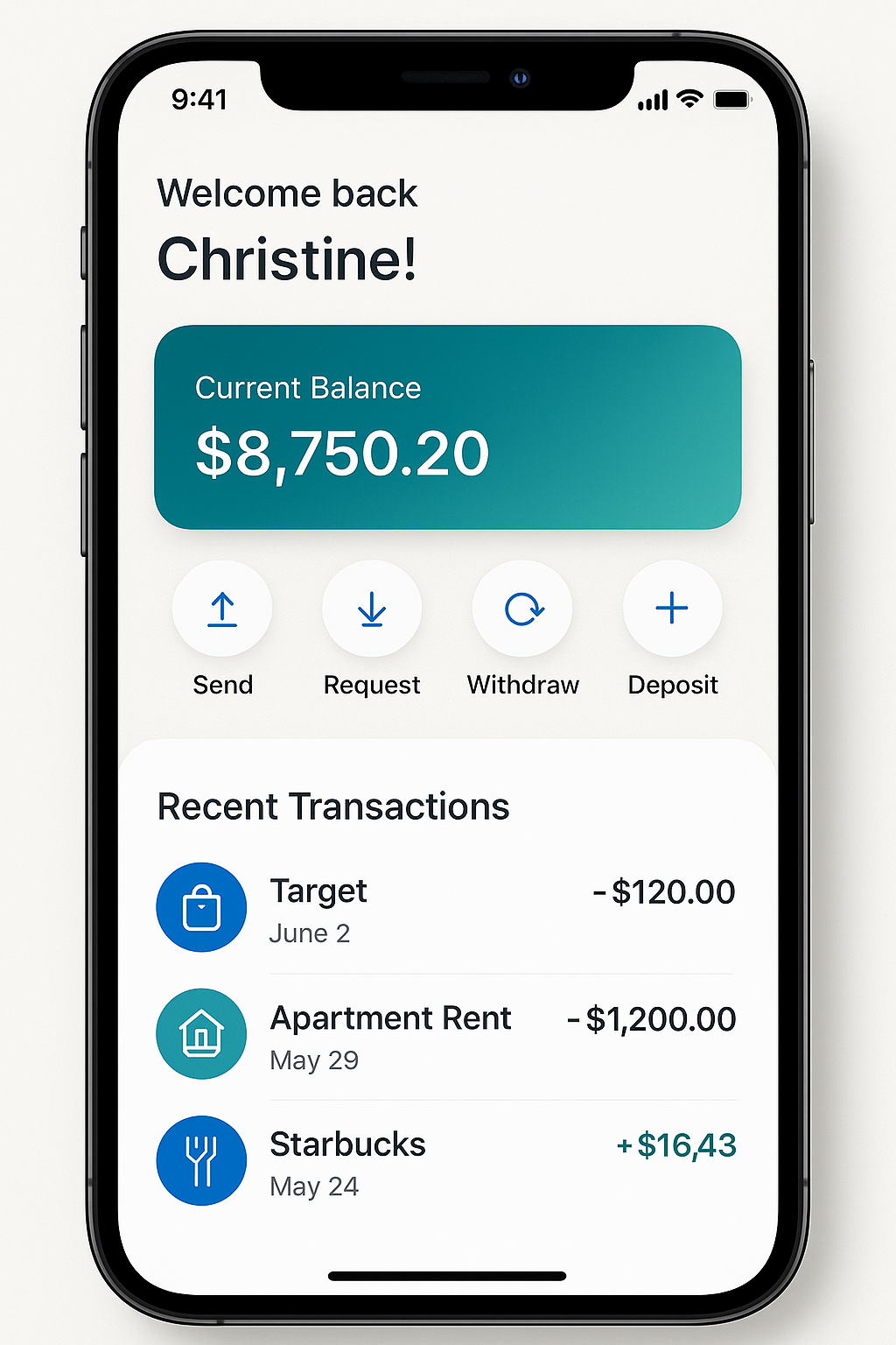
- A clear, personal welcome message: “Welcome back, Christine!”
The goal: make the user feel seen, safe, and in control.
📱 The Interface
The final app UI design focuses on clarity, speed, and familiarity.
🧾 Top section:
- Personalized greeting (“Welcome back, Christine!”)
- Bold, centered balance with subtle gradient
- Icons for primary actions (Send, Request, Withdraw, Deposit)
📊 Mid section:
- Clear Recent Transactions list with familiar brand logos (Target, Starbucks)
- Smart use of color: red for debits, green for credits
- Clear date markers and iconography for quick scanning
The design balances white space with high contrast, reducing cognitive load while improving readability.
✅ Results & Key Wins
We handed the prototype to a small beta test group and tracked task success and confidence:
- 87% completed a money transfer in under 15 seconds
- 92% said the app felt easier than their current solution
- “It feels like Apple made it,” one tester said—our favorite quote from the project.
From a business perspective, this UX refresh could lead to:
- Lower drop-off during onboarding
- Increased repeat engagement
- Stronger brand perception in a crowded fintech market
🔍 SEO Optimized Learnings
This project gave us rich insights for future UX/UI design for fintech apps:
- Minimal, modern UI = more trust in money apps
- Simple navigation and action-first design improve speed and confidence
- Clear visual hierarchy and labels reduce user anxiety
If you’re building a fintech startup, investing in human-centered UI design like FlowPay isn’t just a visual upgrade—it’s a conversion and retention tool.
👋 Final Thoughts
In a space dominated by complexity, FlowPay stands out for doing less—but better. This case study reinforces that with strong UX research, iterative testing, and clean design, you can turn even the most transactional fintech product into something warm, trustworthy, and sticky.
Looking to design a modern fintech experience that actually works for your users? Let’s talk.
