
Zumaridi
Video Conferencing Platform
.png)
Overview
Zumaridi Communications is a Technology Firm focused on developing African centered innovations and digital literacy. The main brief of this project is to improve a better user experience for video conferencing and focus on collaboration.
The Challenge
Zumaridi Communications is looking to rebuild their application to make it more user friendly. The client was also wanting to add data within the website that would provide information for the user.
The Solution
The team and I created a heuristic evaluation which showed the Application needed redesign of both the UX/UI to create consistency throughout the website, and functionality for data and graphs throughout the website.
Tools
Figma, Zoom, Google Drive
Duration
4 weeks
Research
Kickoff Meeting
During the initial kickoff meeting, I reviewed the existing application and through of updates that could be made to the current UX and UI Design. I had questions about how the app functions, its main purpose, and its target user. Our main goal was wanting to empower users to quickly schedule events and search to connect with other.
Competitive Analysis
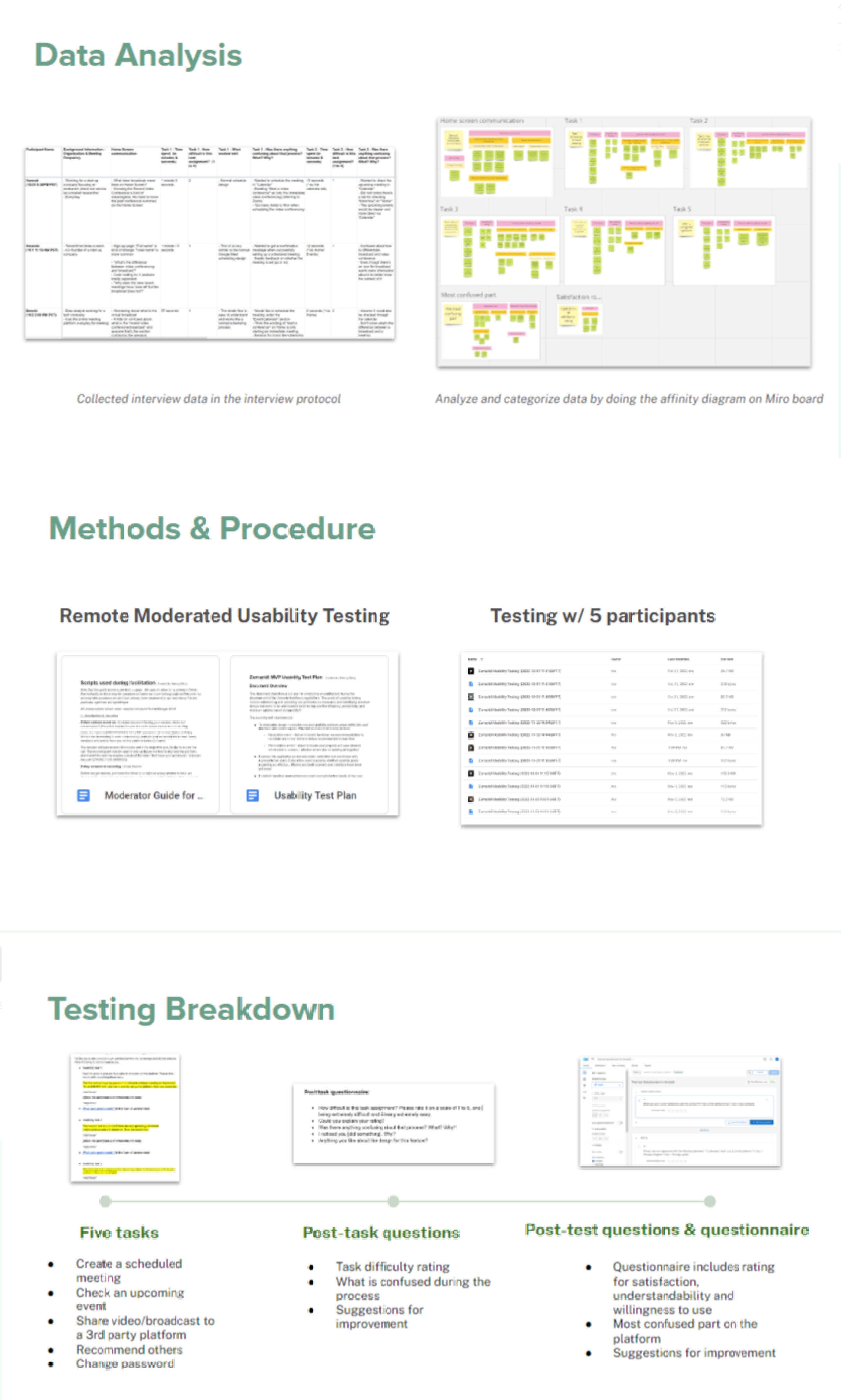
I knew the before I started the design process I needed to search other websites and find best practices for a virtual communications platform. In my search, and with some guidance. I found platforms like Google Meet, Zoom and Others.
Design
Style Guide
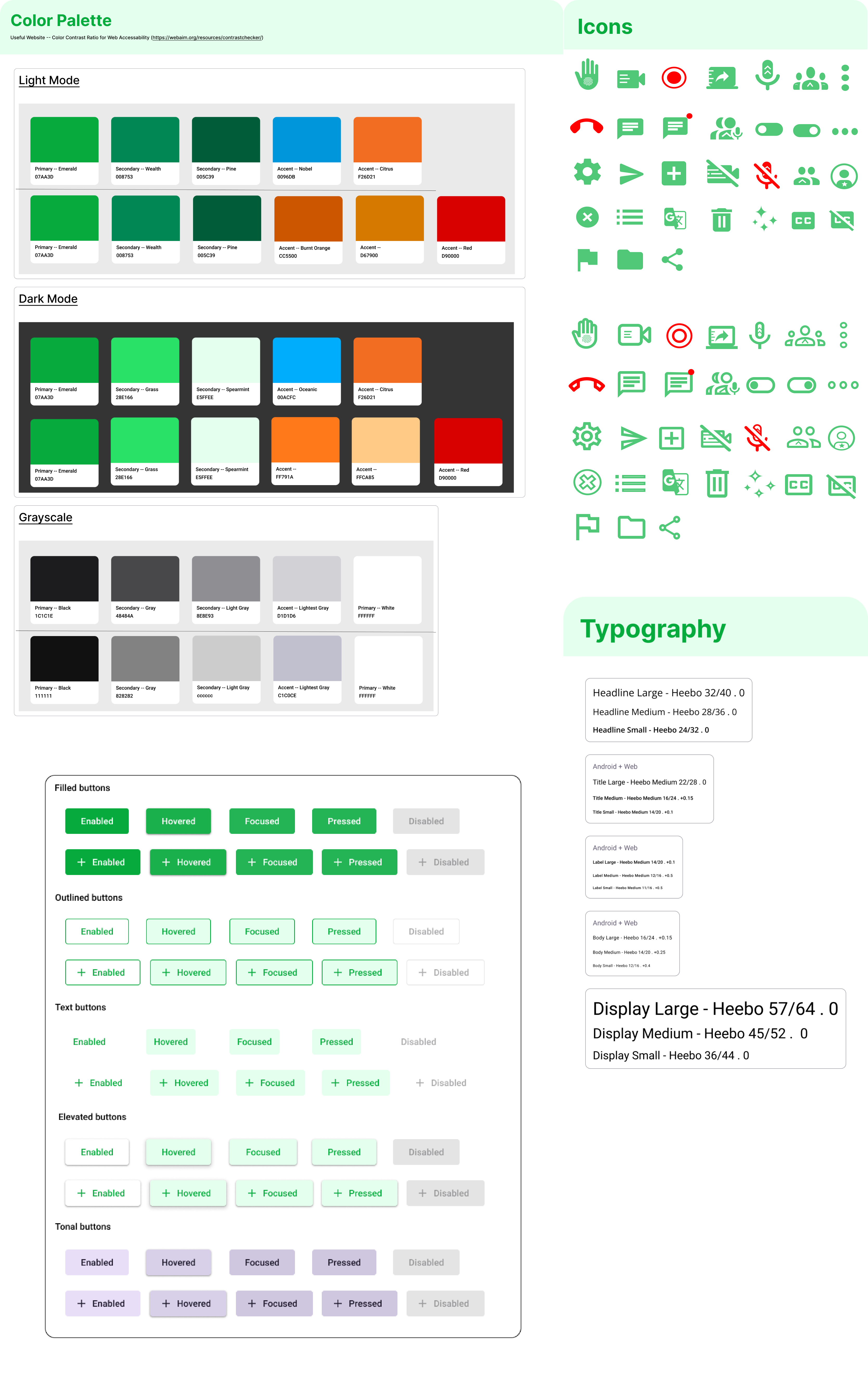
While working on the wireframes my team and I began to think about UI improvements. Zumaridi had a style guide in place, however, many of the colors did not contrast well together and there was not consistency through the pages. I went with the basics to find a more consistent UI flow: typography, color, explorations, grid layouts, and iconography.
Low-Fidelity Wireframes
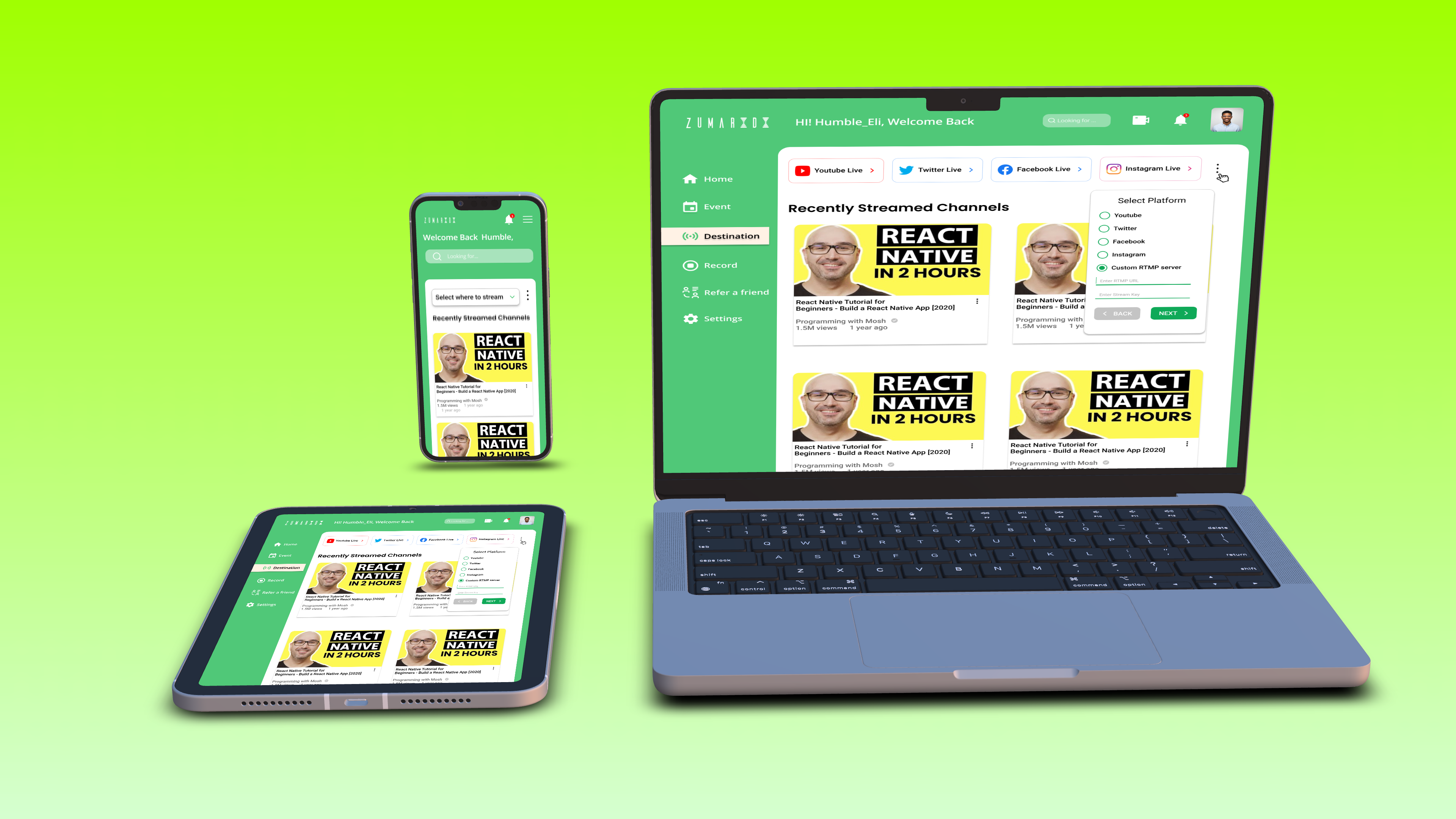
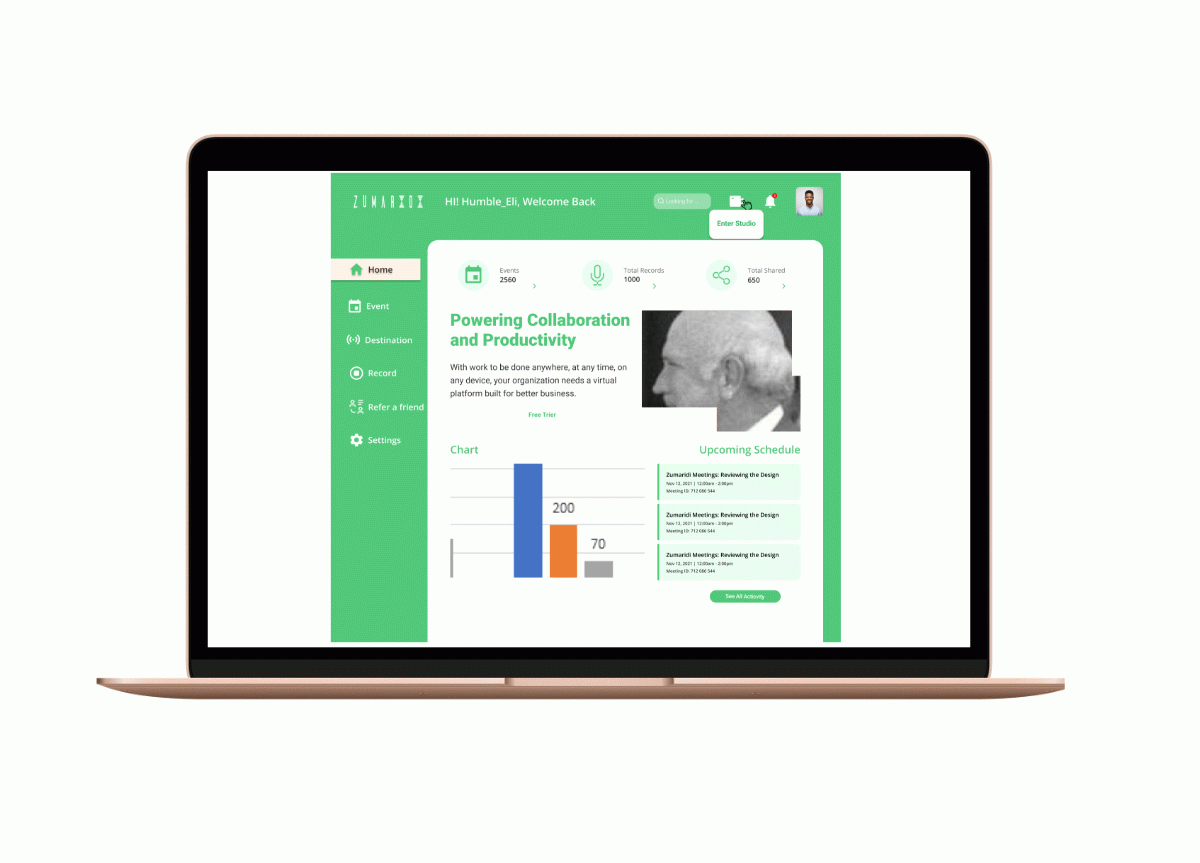
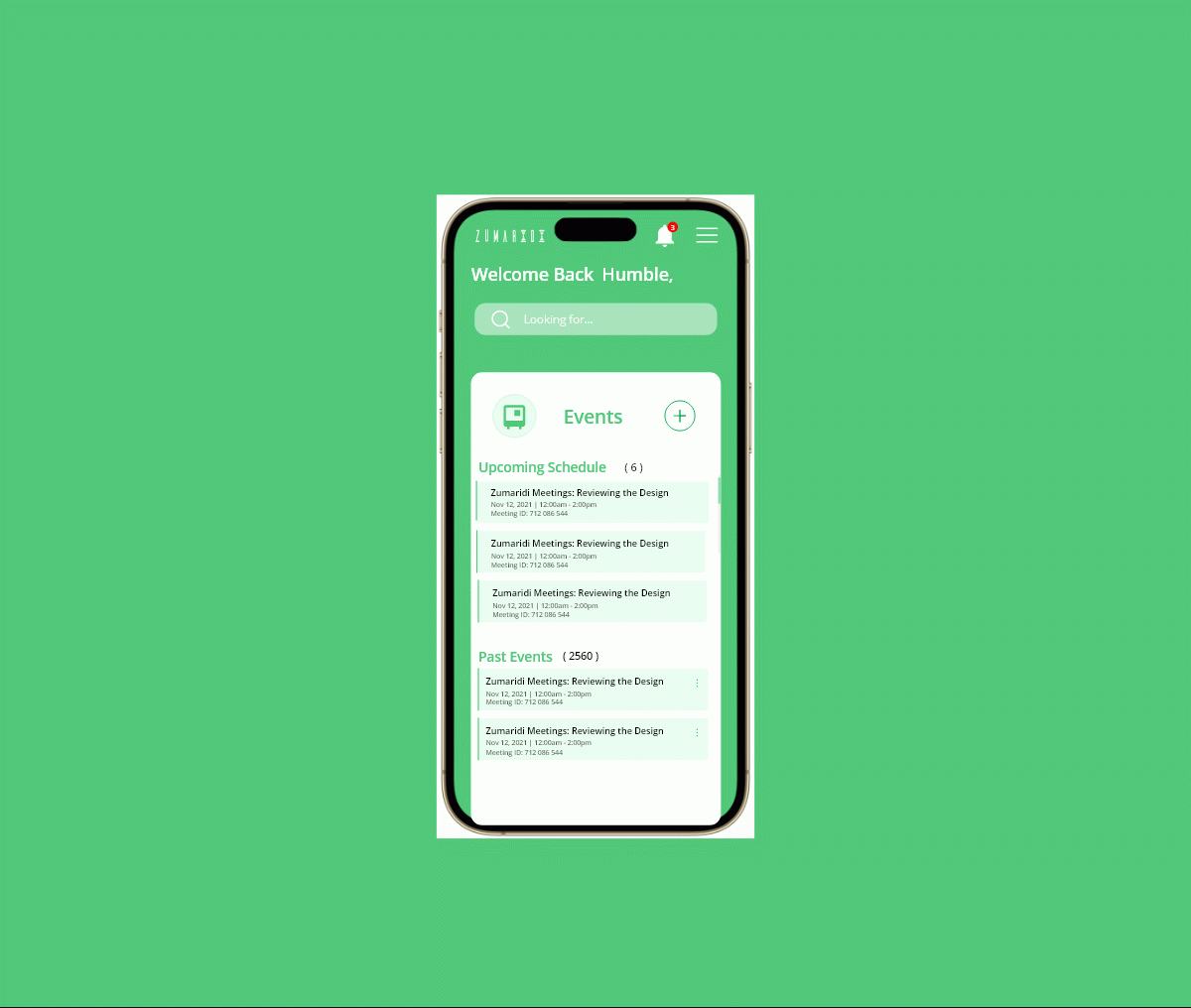
The main focus of the client was, adding resources, such as audio, inputs, etc. The client wanted the information there to motivate the user to use the application more.
I then worked with my team reviewing ways to implement data on a website, and began to picture what we needed for designs throughout the website. We were able to visualize the main components and know what data would pull the user in and make the decision to sign up easier.
High Fidelity Designs
With wireframes and style guide complete. my team and I moved our focus to bringing all the screens to life through high fidelity design.

We worked on the flows as a whole, making sure every flow worked together while feeding off of each others feed back and fixing things as we found them. We stayed consistent working in the component library and using our grid on the style guide. We met in several live sessions to discuss designs. flows, and next steps in the process.
Client Feedback and Redesign
Client Feedback
After my team and I finished the high fidelity screen for the website we shared our work with the client. satisfied with the final product and thanked us for our hard work and dedication. He did have some fixes that he requested.
The team and I took time to make the changes requested by the client and getting the application development ready.
Developer Handoff and Reflection
After we finished our redesign, my team and I prepared annotations of each flow and finalized style guide for handoff to the client and developers.
This project taught me the importance of having flexibility during the decision process. The client was indecisive in some areas, but we listened to his concerns and ultimately produced a website he and his team were excited about.