
S61C
S61CAn app designed to create a community for pilots to connect and get trained
.png)
Overview
The S61C app is a pilot training platform that connects student pilots and certificated flight and ground instructors for training sessions. The goal of the project is to identify issues that hinder the adoption of the pilot training app among student pilots, and redesign the app with an improved user experience and refreshed look.
The Challenge
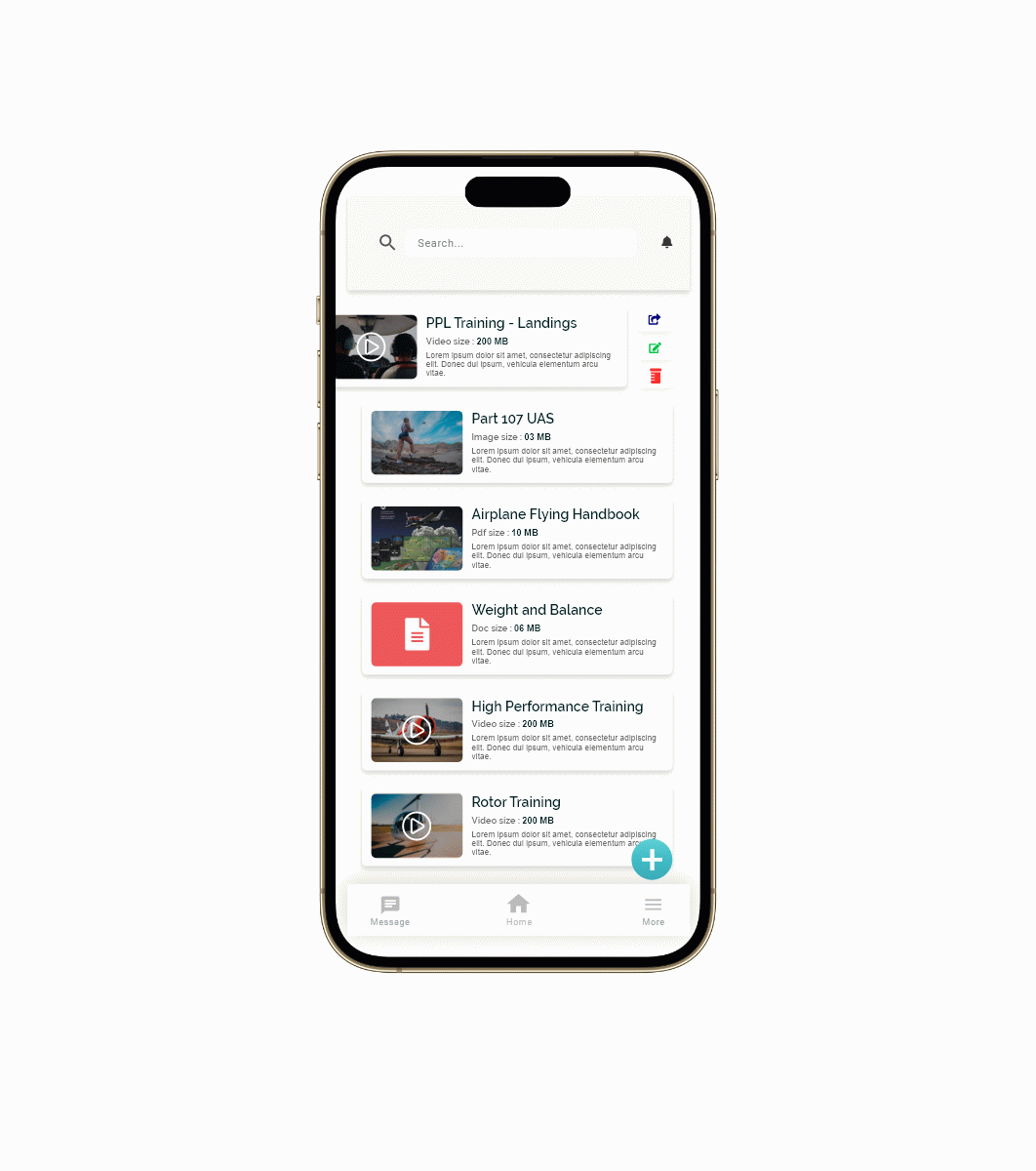
The goal of the project is to create a folder in which pilot students can download lessons and other files to look at or share with other students or instructors.
The Solution
My goal was to experience the app firsthand and identify usability issues from a surface level that hinder a smooth user experience of the App.
Heuristic Evaluation
To be able to identify where the usability and accessibility issues were, my team and I decided to conduct a heuristic evaluation. I took screen shots of pages from the existing app and did a comparison with 10 Usability Heuristics. Issues that were found included were:
- Flexibility and efficiency of use
- Consistency and Standards
- Match between the system and the real world
KickOff Meeting
During the initial kickoff meeting, my team and brainstormed ideas about the app. It helps students to seek out instructors that are well suited for their training needs and styles and allows instructors to find students, and earn and build flight hours needed for future professional pilot careers.
Usability Testing Finding
This usability testing was designed to evaluate whether current design allows users to complete key tasks effortlessly. At the end of test, we asked users to give verbal and written feedback about their experience using the app.
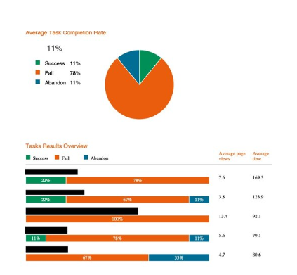
Below are the key data from the usability testing report:
- 15 out of 22 participants completed the test
- 6 out of 15 participants completed the task with an average of 249 seconds.
- On average, the successful participants completed the task after 7.5 page views, but the most efficient flow is supposed to be 3-4 pages.
.png)
Design Direction
We concluded the main frictions of the S61C product are the inefficiency of use and the mismatch between the system navigation and expected task flow. We found that there are some features that the users found more suitable than others:
- Users prefer the slide feature to open or share the document
- The insight suggested a design change navigation, which is typical for mobile apps to provide ease of access.
Findings from designs
By organizing content in a way that matches users, I partnered with one other designer and conducted my design with the following research goals in mind.
- Users are confused by the labeling of file options for this pinpoint, we need to come up with a menu naming scheme that provides a sense of familiarity
- Users are discouraged by the convoluted paths to key content, for this pinpoint, we need to define information hierarchy and prioritize top tasks
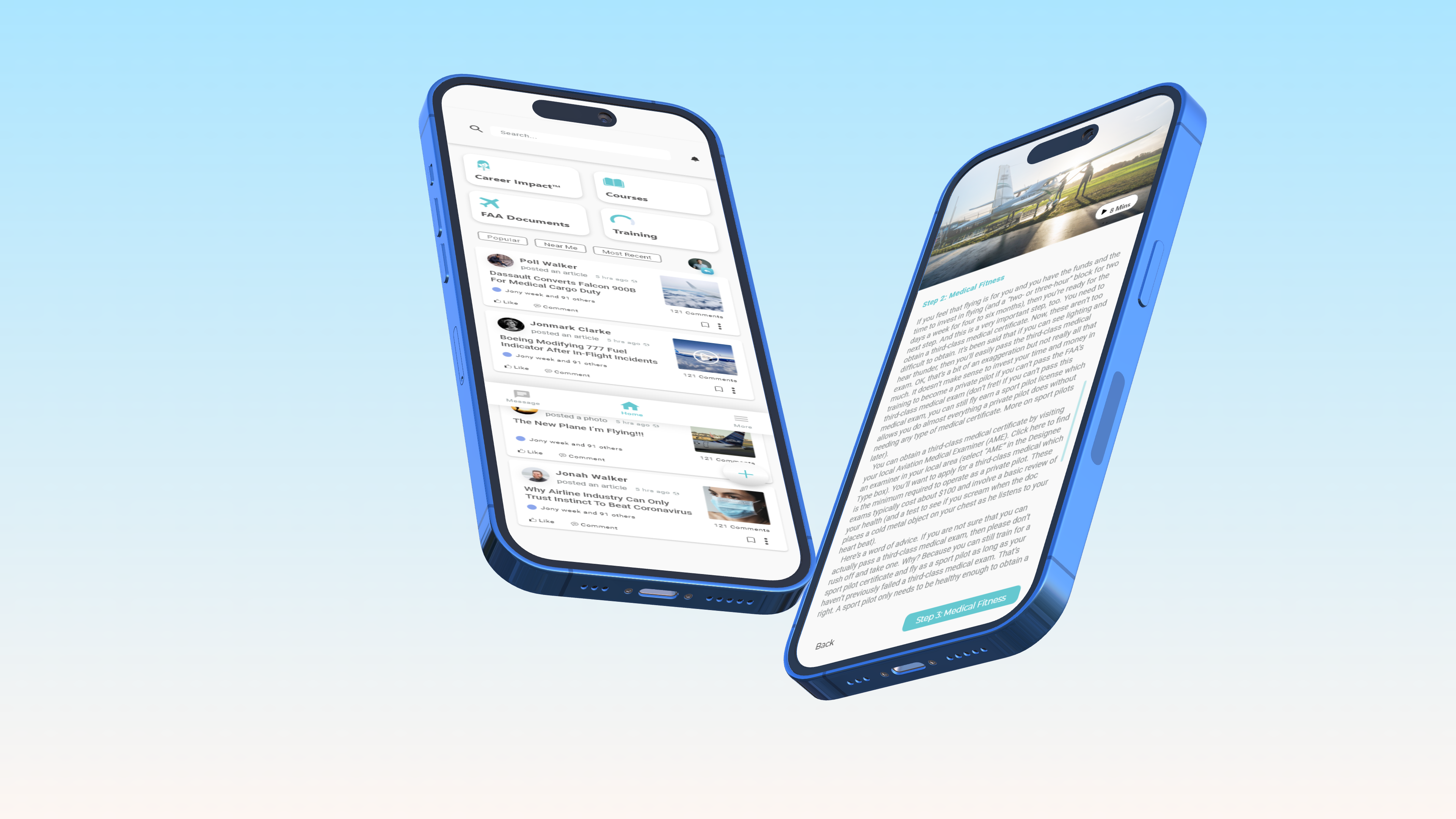
Final UI Redesign
Based on the research, we first mapped the new suggested site map in wireframes, then prototyped new screens.
I partnered with one UX designer and created new UIs for every screen. We delivered a clickable high-fidelity prototype for all the screens, including the student pilot side and the flight instructor side of the app.
Developer Handoff and Reflection
- This is one of my favorite end-to-end product design project, and it was rewarding to see my design being adopted and launched to the public
- This project allowed me to practice skills ranging from foundational research, testing, design, wireframing, prototyping and UI design.
Cross-functional team collaboration
As an UX on a start-up team, I wore the hat of a communicator, a translator and an educator. I learned to communicate research plan with stakeholders early on, translate research data to make a case for my design, and educate non-designers about the value of research-driven and user-centered design.