
Black Mental Health Matters
Overview
.png)
Black Mental Health Matters vision is to promote mental health research, champion for mental health rights for people of African descent to provide an environment where people with trauma can heal.
Challenge
Design the mobile app to help the company improve user experience and provide support and provide research leadership to BMHM show hosts and producers.
Tools
Google Drive, Figma and Slack
Duration
8 weeks
Research
Kickoff Meeting
During the initial kickoff meeting, I reviewed the existing application and through of updates that could be made to the current design. First though, I questioned about how the app functions, its main purpose, and its target user. We put together 20 questions for the client's better understanding.
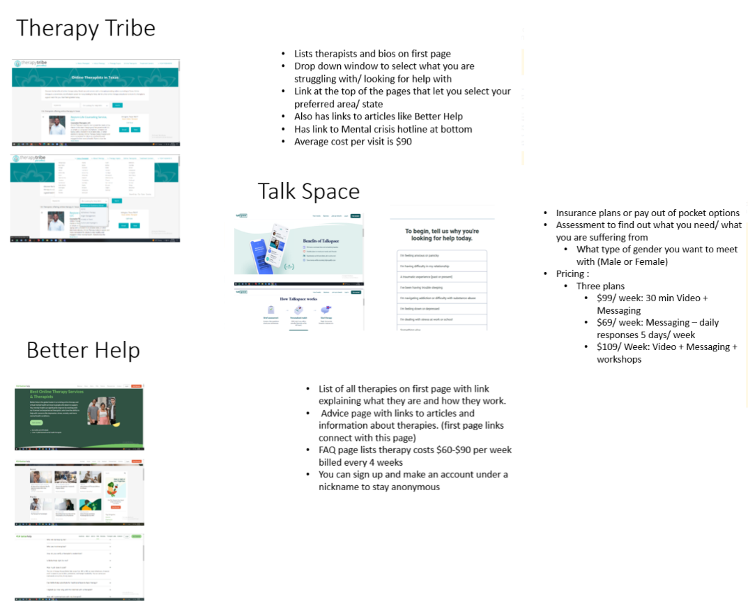
Competitive Analysis
Before starting the design process I knew I needed to find other social based apps that could provide a good start on what best practices looked like. In my search, I found others that all provided ideas on how to imagine this application.
Ideation
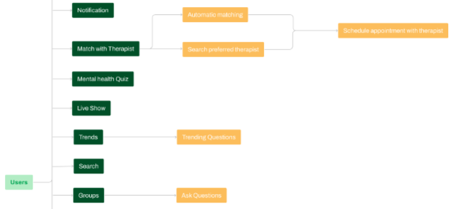
User Flows/Site Map
User flows helped lay out how I wanted three different routes for BMHM. These three routes are scheduling meeting with therapists.
.png)
Design
Style Guide
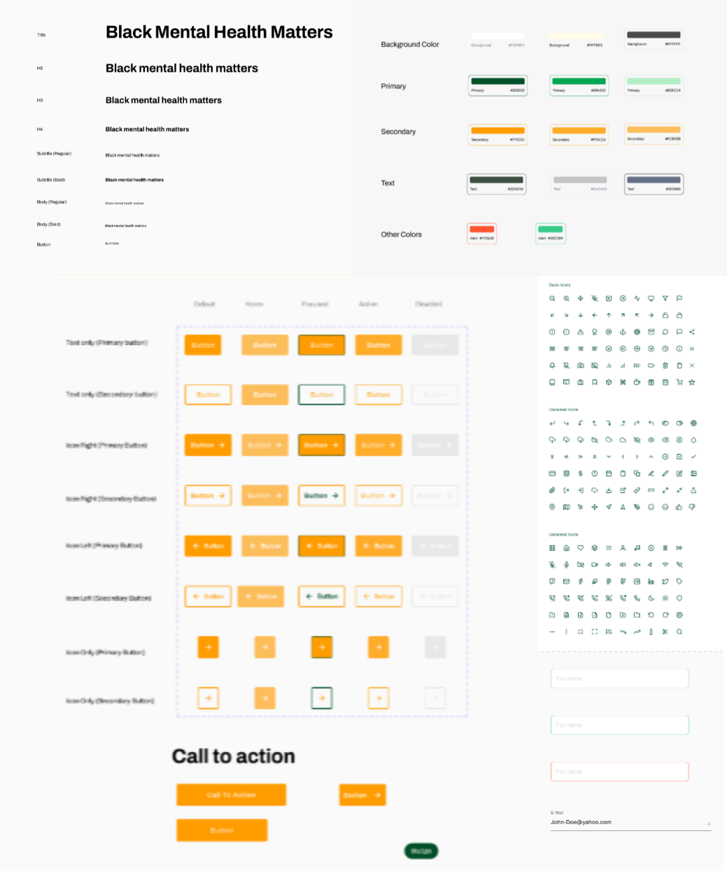
While working on the Style Guide I began to think about the visual improvements needed. The colors on the original app were vibrant and loud. I began to put together the colors needed to attract more users to the app. Once this was in place I started on the styles guide which included: typography, grid, illustrations, iconography, etc.
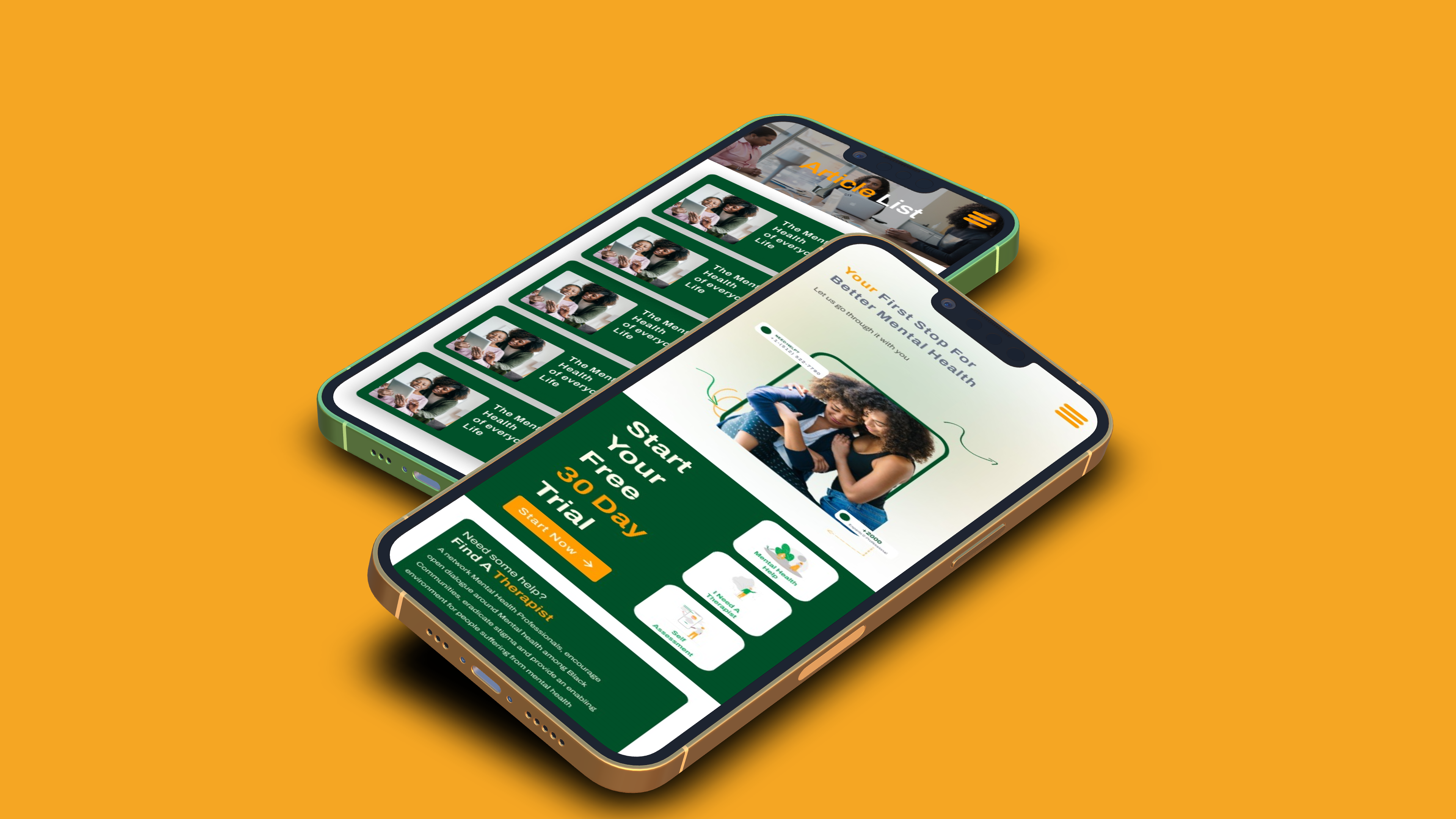
High Fidelity Wireframes
I worked on each flow one at a time while also making sure to plan for other flow so the app was cohesive from screen to screen. Through this process the team provided feedback through which helped piece all of the screens together.
Developer Handoff and Reflection
After we finished our redesign, my team and I prepared annotations of each flow and finalized style guide for handoff to the client and BMHM developers. There were a few changes that needed to change.
- Mobile number should not be visible on the client profile and users should have control over the information they want visible.
- Revert all screens to this size and layout.
Finding Lesson
This project taught me the importance of having a good UX foundation to build the UI upon. Not having a good foundation means you could have to rebuild from the ground up. Even though the client only wanted to improve the UI we knew we needed to rebuild the user flows to ensure users were getting simple and easy to understand flows.